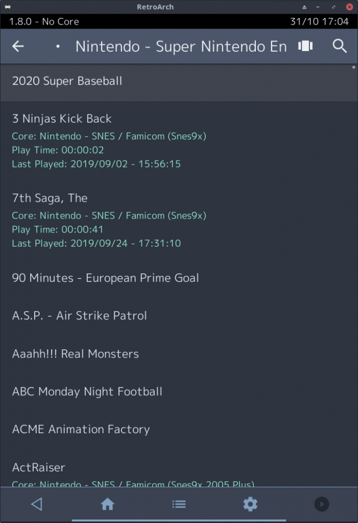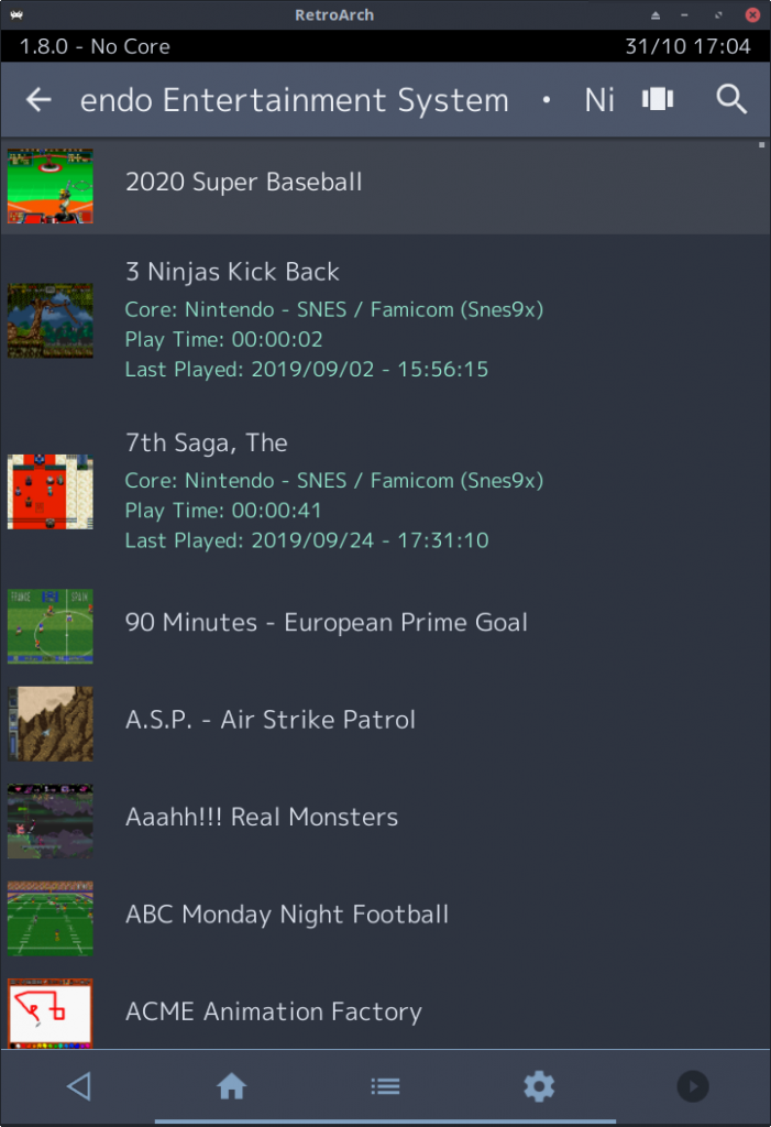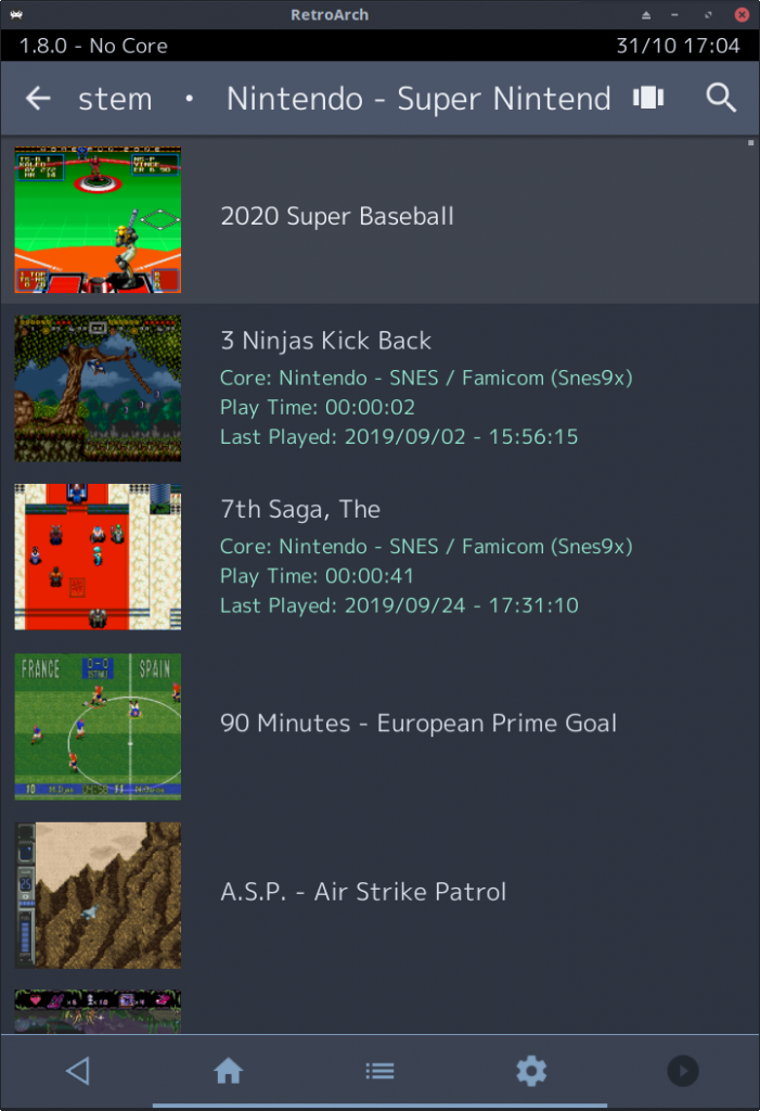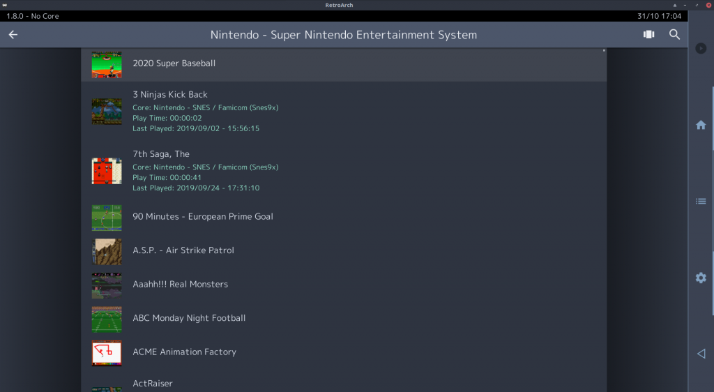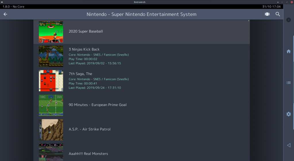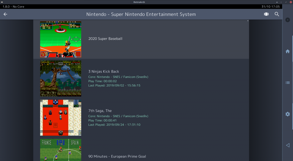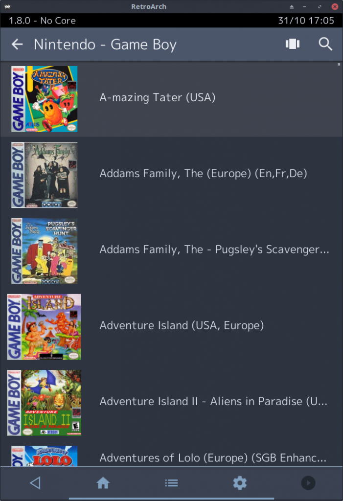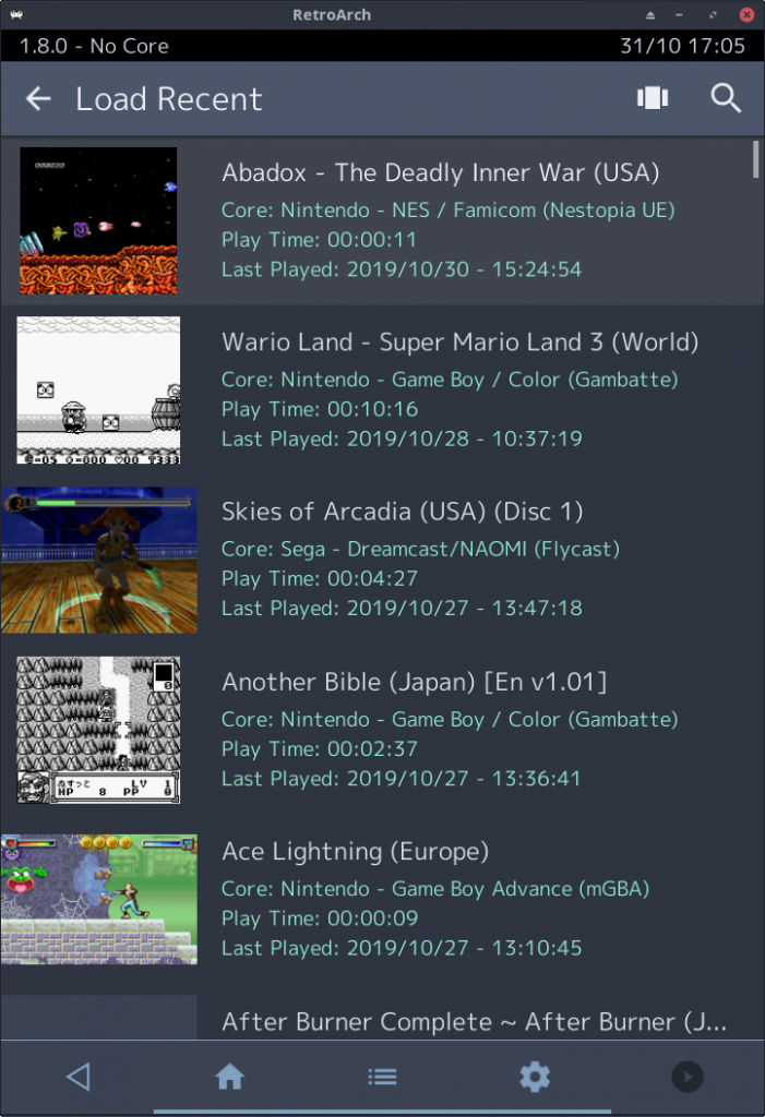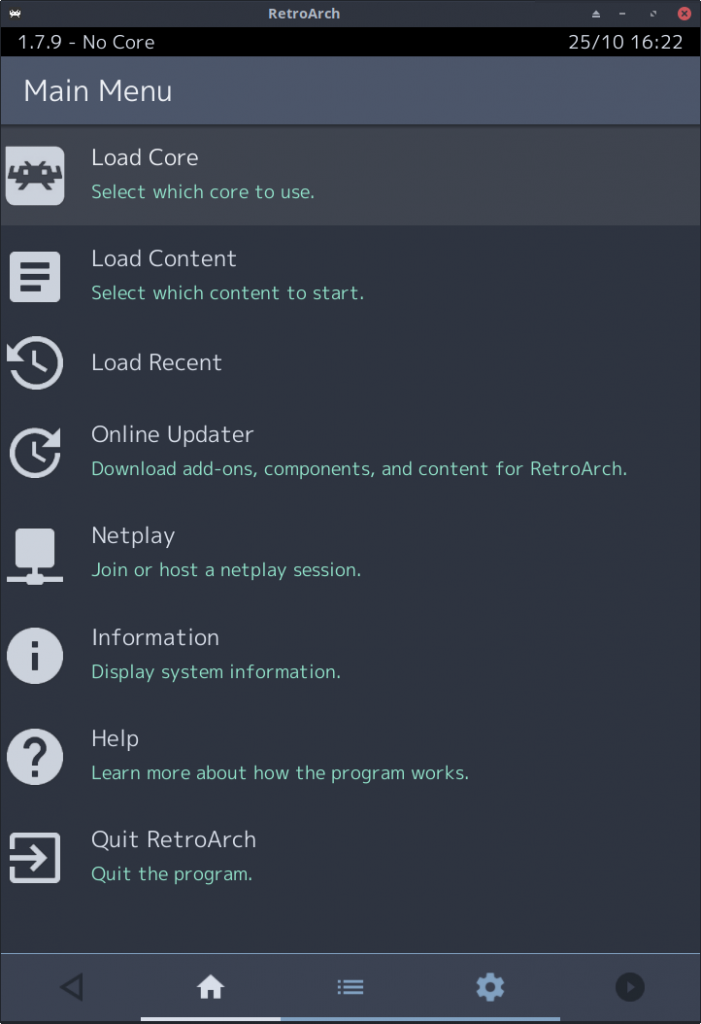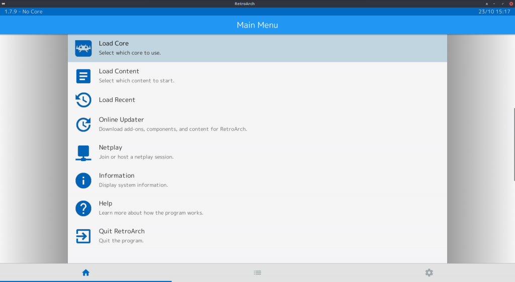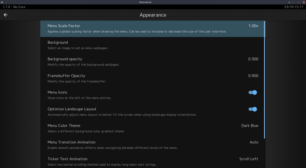
RetroArch 1.8.0 has just been released. The default mobile UI has seen a complete overhaul and we hope this will address many of the usability issues people had with RetroArch’s menu on Android/iOS. Note that we are far from done and that the next versions will have even more enhancements coming up!
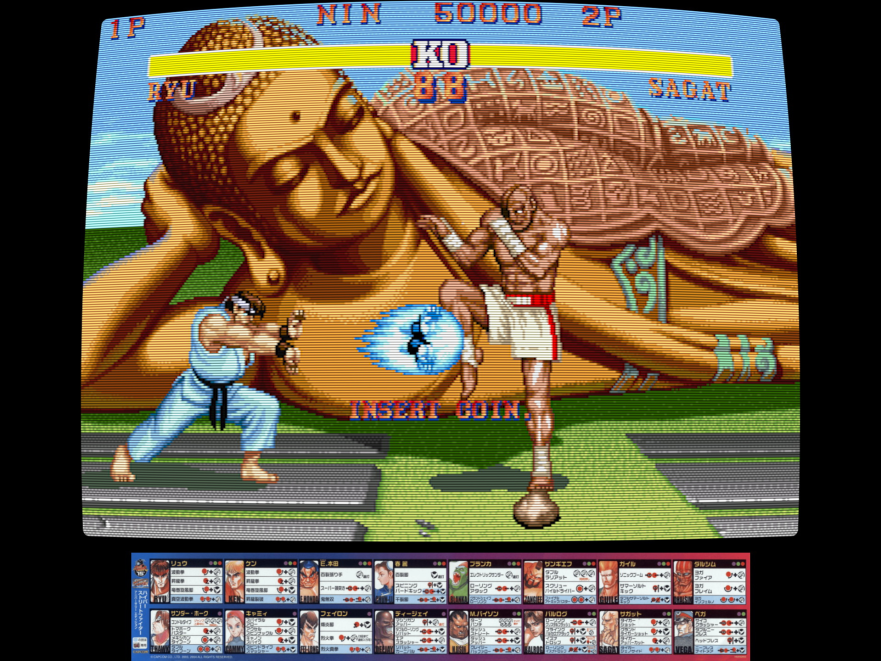
In addition to the MaterialUI menu improvements, we now have MAME overlay compatibility for the OpenGL driver, seamless driver switching, and more!
Grab it here.
If you’d like to show your support, consider donating to us. Check here in order to learn more. In addition to being able to support us on Patreon, there is now also the option to sponsor us on Github Sponsors! You can also help us out by buying some of our merch on our Teespring store!
Big features
Complete overhaul of MaterialUI – UX for Android/iOS massively improved!
With version 1.7.9, we already improved the mobile UX significantly by adding touchscreen gestures and better touch responsiveness.
This however pales in comparison to what has been done for version 1.8.0 in this department. We will quickly go over the major highlights, most of the text here has been written by jdgleaver (the author of these changes) with only minimal edits by myself –
New menu scaling
At present, Material UI is scaled according to screen resolution and hard-coded magic numbers. This ‘kinda-sorta’ works on some mobile devices, but in general (and specifically on desktop computers and tablets) the interface is too large, and scaling is highly inconsistent when resizing windows. To combat these inadequacies, there existed a ‘DPI override’ feature which allowed the user to set a specific scale – but this didn’t work in real-time (so adjustments were blind), and it’s not user friendly (since the average user can’t be expected to know the correct DPI setting for their screen).
This new version modifies the scaling of Material UI such that it uses the hardware-reported DPI value of the display, with empirical adjustments to accommodate very large and very small screen sizes (where normal DPI scaling fails). This should ensure an appropriate default interface size regardless of hardware. Moreover, it removes the ‘DPI override’ and replaces it with a generic Menu Scale Factor under User Interface > Appearance, which is a simple fractional multiplier (much easier for the user to understand!). This Menu Scale Factor is now also used by XMB (instead of the previous XMB-specific scale factor) – it is intended that Ozone and menu widgets will obey this setting in the future.
- DPI Override Removed – Menu Scale Factor comes in its place – starts out at 1.00x and can be made smaller or higher than the default value
- Material UI now correctly readjusts its layout when screen orientation changes on mobile devices
- Material UI now resizes in real-time when the user manually sets the Menu Scale Factor (this never worked properly with the old DPI override)
- Material UI no longer leaks memory on ‘context reset’
Menu animations
A new ‘Menu Transition Animation’ option has been added under User Interface > Appearance. When this is enabled, menu transition events are animated.
All sorts of animations have been added – fade-in effects, slide effects, etc. If you dislike any of these, you can always turn the setting off completely to go back to the previous behavior.
System bar
A new Android-style ‘system bar’ has been added. This shows current core name, clock and battery level.
Navigation bar

The navigation bar is now shown at all times – i.e. it is an actual navigation tool, rather than a ‘top-level-menu’ curiosity.
Two new context-sensitive buttons have been added:
On the bottom left we have a ‘back’ button. This performs the same function as tapping the menu bar, but the button is in a more ergonomic/standard position. This should address most of the complaints Android users have about RetroArch ignoring the hardware back button.
On the bottom right we have a ‘resume content’ button. This means we can easily change/test runtime settings without performing finger gymnastics. e.g. we can change a core option or apply a shader and immediately toggle the menu off without having to hit back to get to the quick menu, and scroll up to the resume content entry.
Auto-Rotation
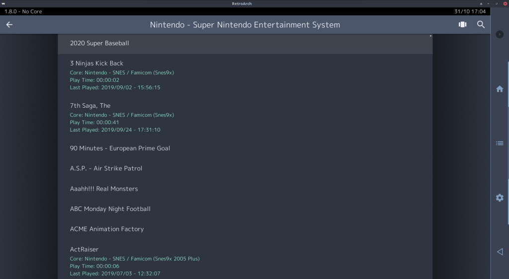
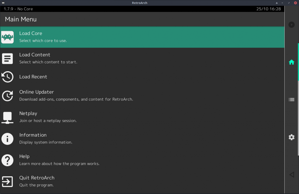
A new ‘Auto-Rotate Navigation Bar’ option has been added under User Interface > Appearance. When enabled (this is the default setting), the navigation bar is moved to the right hand side of the screen when using landscape screen orientations. It looks something like this:

If you don’t like this and you want it to always appear at the bottom of the screen, turn this option off.
Title bar
The title bar now uses a larger font, and the sublabel font has also been enlarged a little, to more closely align with Material Design standards.
Optimize Landscape Layout
A new Optimize Landscape Layout option has been added under User Interface > Appearance. This is intended to address the rather uncomfortable appearance of Materail UI in landscape orientation on wide displays (particularly on the desktop). The option is disabled by default on mobile platforms (like iOS/Android), and enabled by default everywhere else. When enabled, it looks something like this:


Graceful switching between video drivers
Graceful switching between video drivers has been added for Linux and Windows PCs thanks to Rinnegatamante (Patreon here). This feature originated as a bounty request, and it’s on the verge of being completed.
RetroArch in the past behaved unpredictably and unstably when switching to cores that wanted a context other than what was currently active. This could happen because of video_driver settings being different in a core config override or because a core’s core options were telling it to use a different renderer than what was active (e.g., GL vs Vulkan)
What happens now, is that RetroArch can seamlessly switch video drivers if a core requires it.
Example –
one of the new cores we have added over the past few weeks, VitaQuake 2, is a core that has two renderers. It has a software renderer and an OpenGL 1.x renderer. Say that RetroArch is running with the ‘vulkan’ video driver. We want to load VitaQuake 2.
What would happen with RetroArch 1.7.9
- The renderer of VitaQuake 2 has two options – Software and OpenGL. Because there is no hardware context in the core for Vulkan, it would switch to Software.
What happens now with RetroArch 1.8.0 (with driver switching enabled)
- The renderer of VitaQuake 2 has two options – Software and OpenGL. We make the assumption that you wouldn’t want to use the software renderer if OpenGL is available, so instead, RetroArch will seamlessly switch to OpenGL. When you unload the core/game, it will switch back to ‘vulkan’, so the driver switch will not be written to the config file.
What if you still want to use the Software renderer with a core like this with Vulkan?
That is certainly possible. To do this, we need to turn off the ‘driver switching’ feature. First, you need to make sure that ‘Show Advanced Settings’ is enabled under ‘User Interface’ settings. Once you have made sure of that, go to ‘Settings -> Core’. Then turn off ‘Allow cores to switch the video driver’. It should now behave like before again.
What if a core has several hardware context renderers? (like Dolphin/PPSSPP)
Cores like Dolphin and PPSSPP have several renderers available, such as OpenGL, Direct3D11 and Vulkan. Say you have RetroArch running with the vulkan driver. It would then naturally pick the ‘Vulkan’ renderer. Ditto for OpenGL and Direct3D11. So nothing changed there in that regard.
What is this particularly useful for?
The big issue with using the Vulkan video driver in RetroArch in the past (or Direct3D 11) is that while some software rendered cores might run faster with these drivers vs. OpenGL, there are plenty of Libretro cores that require the use of OpenGL. With this new feature, it will properly fallback to OpenGL for these exclusive cores but still use Direct3D 11 or Vulkan for all other cores. You can get the best of both worlds this way.
MAME layout compatibility with OpenGL driver

This started as a bounty request, and it has now been implemented at least for the regular OpenGL driver.
If you don’t know what MAME layout files are, you can read this here.
How to get this working?
First, ensure that you are using the OpenGL driver. NOTE: Make sure this is ‘gl’ driver, ‘glcore’ will not work right now but might work in a future version. Only the regular ‘gl’ driver right now will work with MAME layouts.
NOTE: It’s only available for the GL driver right now, but we would like to extend it to other drivers in the future. Automatic loading of layouts based on content filename would also be a good improvement.
Changes
1.8.0
- AI SERVICE: Added in fix for BMP returns to AI service. Added in label passing to AI service call
- BSV: Fix BSV recording/playback
- BUGFIX: Fix crash when setting Thumbnail Directory
- BUGFIX/STABILITY: Set “Automatically Add Content to Playlist” to false by default, this was unstable on PS3 and Mac and other platforms potentially as well.
- COMMON: Graceful driver switching for Windows and Linux
- COMMON: Cache frame before converting 0RGB1555
- LAKKA: Wi-Fi Access Point settings
- MENU: Menu scaling improvements
- MENU/MATERIALUI: There are no longer any animation glitches when ‘wraparound’ scrolling from the last entry in a list to the first, or when performing horizontal swipe navigation gestures on certain settings-type entries
- MENU/MATERIALUI: List entries underneath the title and navigation bars are no longer highlighted when touching the title/navigation bars (this was only a cosmetic issue, but it was annoying…)
- MENU/MATERIALUI: The current menu list is no longer reloaded when pressing the currently active tab on the navigation bar
- MENU/MATERIALUI: The ticker text spacer has been set to a ‘bullet’ character (same as Ozone)
- MENU/MATERIALUI: The default colour theme has been set to ‘Ozone Dark’
- MENU/MATERIALUI: Three new colour themes have been added.
- MENU/MATERIALUI: A new Menu Transition Animation option has been added under User Interface > Appearance. When this is enabled, menu transition events are animated
- MENU/MATERIALUI: The navigation bar is now shown at all times – i.e. it is an actual navigation tool, rather than a ‘top-level-menu’ curiosity
- MENU/MATERIALUI: Two new context-sensitive buttons have been added to the navigation bar – back button and resume button
- MENU/MATERIALUI: A new Auto-Rotate Navigation Bar option has been added under User Interface > Appearance. When enabled (this is the default setting), the navigation bar is moved to the right hand side of the screen when using landscape screen orientations
- MENU/MATERIALUI: The playlists tab is now correctly hidden when User Interface > Views > Show Playlist Tabs is disabled
- MENU/MATERIALUI: Material UI now correctly readjusts its layout when screen orientation changes on mobile devices
- MENU/MATERIALUI: Material UI now resizes in real-time when the user manually sets the Menu Scale Factor (this never worked properly with the old DPI override)
- MENU/MATERIALUI: Material UI no longer leaks memory on ‘context reset’ (fonts were previously never free()’d)
- MENU/MATERIALUI: A new Android-style ‘system bar’ has been added. This shows current core name, clock and battery level
- MENU/MATERIALUI: A new search icon is shown on the title bar when viewing playlists and file browser lists. Pressing this launches the search interface
- MENU/MATERIALUI: The title bar now uses a larger font, and the sublabel font has also been enlarged a little, to more closely align with Material UI standards
- MENU/MATERIALUI: A number (quite a large number) of layout/spacing issues have been fixed
- MENU/MATERIALUI: The existing colour theme handling code is not fit for purpose, so the whole lot got ripped out and reimplemented. In doing so, also adjusted all the theme colours to better match Material UI standards – with a few liberties taken for aesthetic purposes.
- OSD: Fix fast forward indicator when not using menu widgets
- PSP1: Remove duplicated FPS indicator on the screen
- LIBNX/SWITCH: Make audren threaded audio driver the new default
- VIDEO LAYOUT: Add video layout MAME overlay compatibility. Enabled for Windows/Linux/OSX/iOS/Android/libnx. Only works with GL driver for now, no glcore yet
