This is an addendum article to our main RetroArch 1.8.2 release post. To read the main article, read this here.
Fullscreen thumbnail viewer
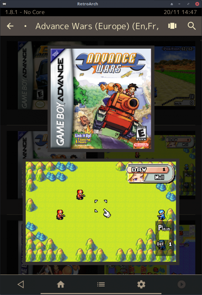
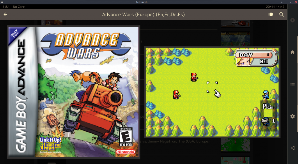
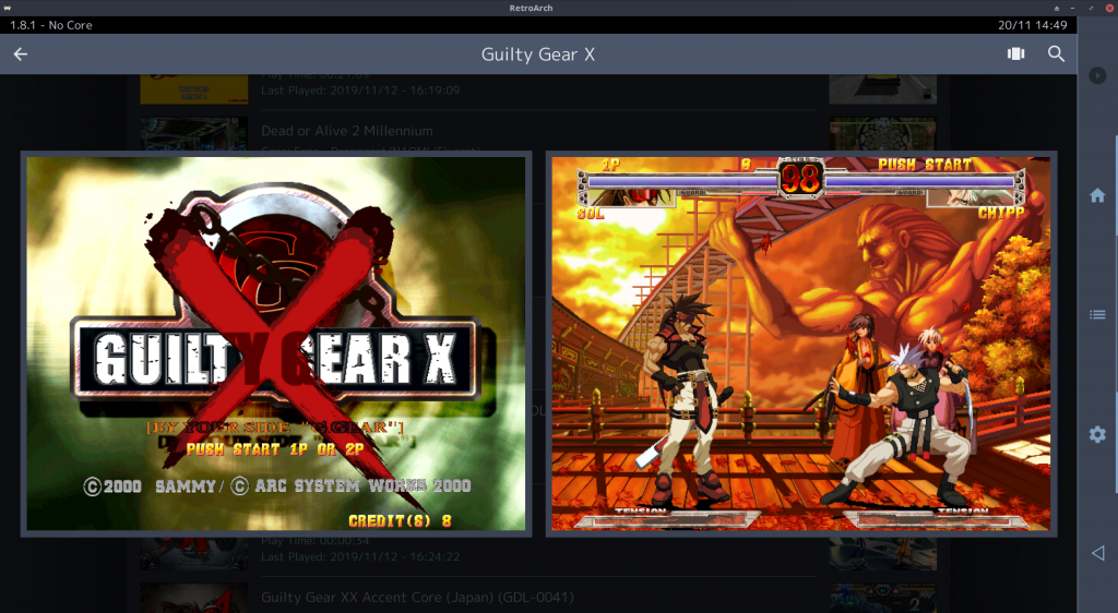
We have added a fullscreen thumbnail viewer to Material UI, Ozone, and XMB. It’s analogous to RGUI’s fullscreen thumbnail view mode.
When viewing any playlist thumbnail view, fullscreen thumbnails may be shown for the selected entry by:
Long pressing the entry (mouse or touchscreen)
Pressing start on a gamepad
Pressing space on a keyboard
When fullscreen thumbnails are shown, any menu action will disable them again.
Here are some random example screenshots of fullscreen thumbnails in action:

MaterialUI – Dual thumbnail support
RetroArch has added dual thumbnail support to the Material UI menu driver.
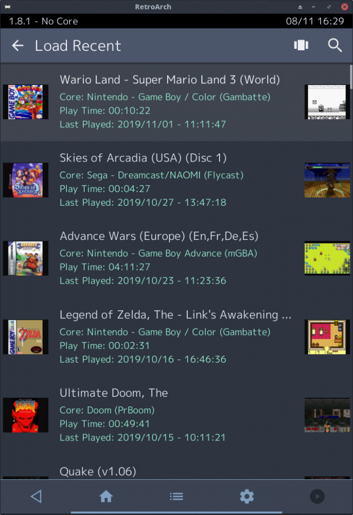
A new Show Secondary Thumbnail In List Views option has been added under User Interface > Appearance. When enabled, two thumbnails are shown in all List views (Small, Medium, Large) – but only if the display is actually wide enough to show two thumbnails. It looks something like this:
If the Secondary Thumbnail option is set to OFF and the user explicitly requests a thumbnail view with secondary thumbnails enabled, the global Secondary Thumbnail option will automatically be set to an appropriate value. This prevents users with fresh installs (default options) from getting a list of ‘missing thumbnail’ images when selecting a view with mandatory secondary thumbnails. NOTE: This does not affect per-playlist thumbnail overrides – if the user wishes to force disable secondary thumbnails with such an override, they are still free to do so.
A new Draw Thumbnail Backgrounds option has been added under User Interface > Appearance. This is enabled by default (which matches the existing behaviour), and when disabled allows thumbnails to be drawn without a solid colour background.
Selective hiding for settings
Several important improvements have been made when it comes to the settings and the overall presentation of them.
Let’s go over some of the most important changes:
- We have subdivided many cluttered entries into submenus. Examples: Video -> Scaling, Output, CRT Switch Res.
- We have included dropdown lists now for several important actions, such as ‘shader parameters’.
- We now selectively hide options based on context. For instance, if you have Vsync disabled, it makes no sense to show you ‘Vsync Swap Interval’ as well. So when Vsync is disabled, the screen gets refreshed and the Swap interval setting is not shown until you turn Vsync on again. We have made sure to implement this in as many settings categories as possible, see our exhaustive changelog for the nitty gritty.
- There were many settings which were not clickable before with touch-based devices such as mobile phones.
Let’s now go into some specific examples of what we consider by increased usability – let’s take Video -> Scaling –
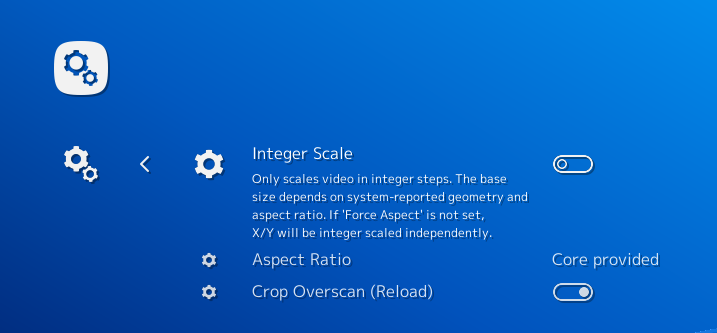
Aspect Ratio is currently set to ‘Core Provided’. We now bring up the dropdown box, and we select ‘Custom’ from the list.
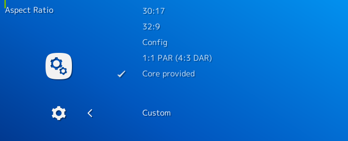
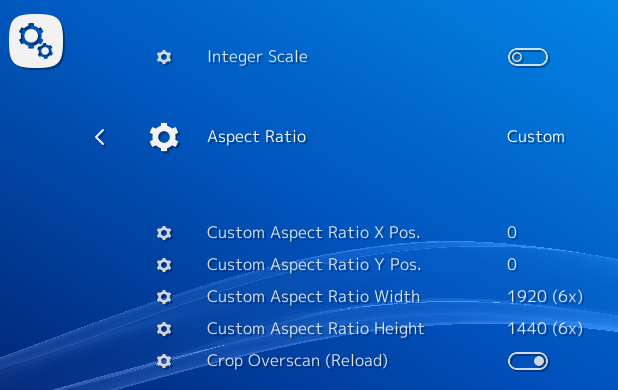
Upon selecting ‘Custom’, we can now see several entries have appeared – ‘Custom Aspect Ratio X Position’, ‘Custom Aspect Ratio Y Position’, ‘Custom Aspect Ratio Width’, and ‘Custom Aspect Ratio Height’. If you read the description for X and Y position, you’ll notice that the sublabel states that if ‘Integer scale’ is enabled, these settings will be ignored and the X/Y position will be done automagically. In the past, we’d just have listed all these settings regardless of what aspect ratio is selected. Now watch what happens when we set Integer Scale to enabled –
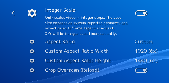
As you can see, X and Y Position are now hidden from view. They won’t be shown again until you turn Integer Scaling off, at which point they’ll actually serve a purpose again.
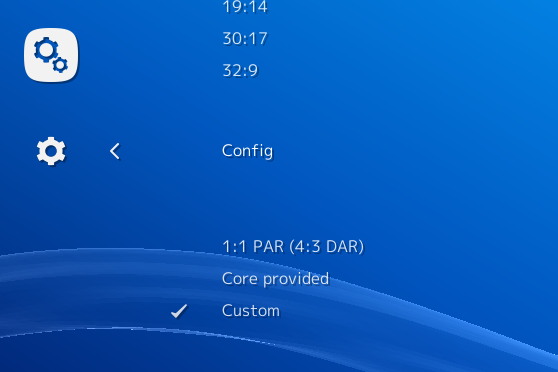
Now let’s try another aspect ratio. This time we’ll select ‘Config’.
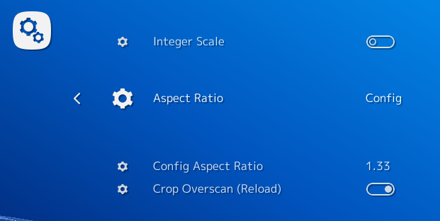
We notice that the Custom Aspect Ratio settings are now gone, since they no longer serve a purpose for the currently selected aspect ratio. Instead, another setting is shown, Config Aspect Ratio.
Now, to contrast that with how things were previously –
in the past, not only would all the Custom Aspect Ratio settings be shown regardless of whether the aspect ratio was actually set to ‘Custom’, but also ‘Config Aspect Ratio’ would be shown even though the user might not have set Aspect Ratio to ‘Config’. This of course caused lots of unnecessary clutter which leads to confused users who can’t find the needle in a haystack anymore.
We have implemented tons of these usability flourishes everywhere and we hope this leads to an increased positive user experience.
MaterialUI Playlist management
It’s now possible to long press a playlist inside the Playlist tab and go to a Playlist submenu. From here, you can do various actions to the playlist, including deleting the playlist and setting a default core association to every entry in the playlist that has not yet been configured to start with a specific core.

